BRANDING REFRESH
As we embark on a branding refresh to prepare for the next 50 years, we are taking the opportunity to inspire all areas of the ministry with renewed energy and purpose. We want to update our logo and all visual expressions to reinforce who we are.
FAQ’S
What do you mean by a brand refresh?
Most of us don’t necessarily think of Village Seven Presbyterian Church as a brand. Branding is simply the term by which we identify and associate certain characteristics and points of difference between ministries and organizations. All brands need the occasional refresh. It’s essential to stay current, focused, inspired and motivated while staying true to the mission. This is one of five brand refreshes that have happened for Village Seven over the last 50 years.
I thought a brand was a logo. Is that what this project is about?
Yes, and not exactly. A logo is how people recognize, relate to, and connect with a brand. Although a meaningful logo is important, it is the clarity of direction and purpose that lead to the most enduring brands. The role of a logo is to simply help us identify brands of products and services we have confidence in. It is what the logo stands for and what it means that is more important. It’s not the cross, but what the symbol stands for that matters most. That’s what this project is about — more than a logo.
Why are we doing this?
We have to be sure we have clarity on where we are headed, what challenges we need to overcome, and what opportunities we can take advantage of. As our team has undergone many changes in the last couple of years, this process provides an opportunity for re-alignment.
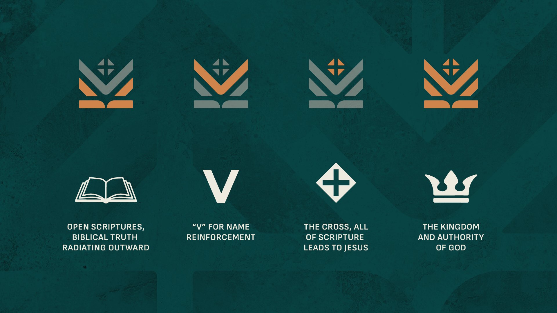
What does our logo represent?
Our logo design is a purposeful solution that reflects what is most true about what we stand for. That’s why it was so important to spend time on research to understand what we wanted to reinforce about our brand. While aesthetics are important, it is even more important that we create symbology that’s true, meaningful, relevant, and distinctive. Our new logo fundamentally stands for biblical truth but also incorporates other reinforcing features.
What did we learn from all the research about our brand refresh change?
We found in our research of Village Seven Presbyterian Church that there were strong feelings that we needed an updated change that would be more distinctive, reflective of what makes us different, more recognizable, memorable, and appealing to a broader audience. The research clearly told us that we needed a change that would more effectively “tell our story”, and we have a great story to tell.
How easy will it be for people to understand what our logo means?
We recognize that not everyone is going to immediately understand what our logo stands for, and that’s OK. But we believe we have a logo that will get attention, be recognized, and be memorable. Meaning and understanding will be built over time, as is often the case with updated logo introductions. The important thing is that our logo actually stands for something, and people will come to understand that. We took great care to embed symbology into the logo that reinforces who we are and what we stand for.
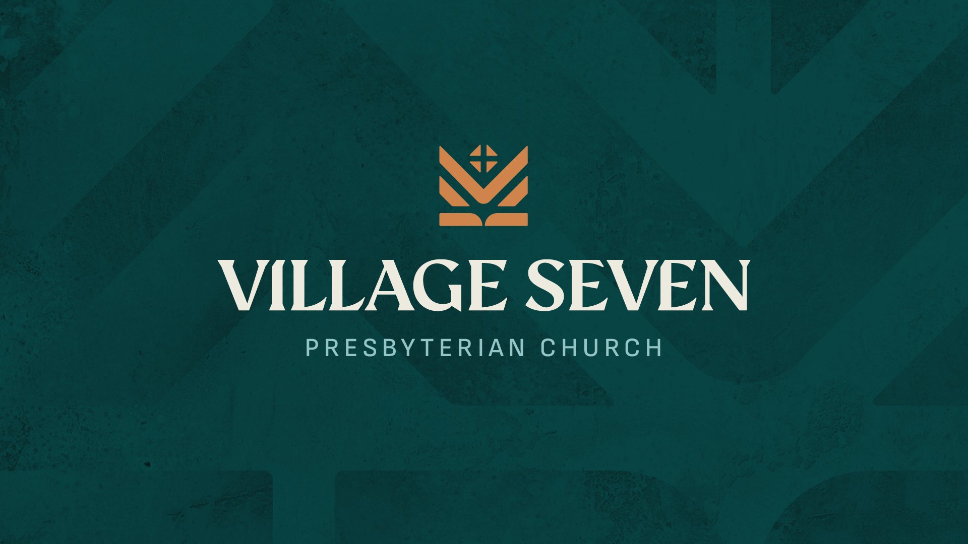
What is the reason behind the change in the “Village Seven” typeface?
One of the key objectives of our new logo design was to respond to one of our research findings to be seen as more welcoming and approachable. The new typeface has more distinctive details and personality that give it a more approachable feel.
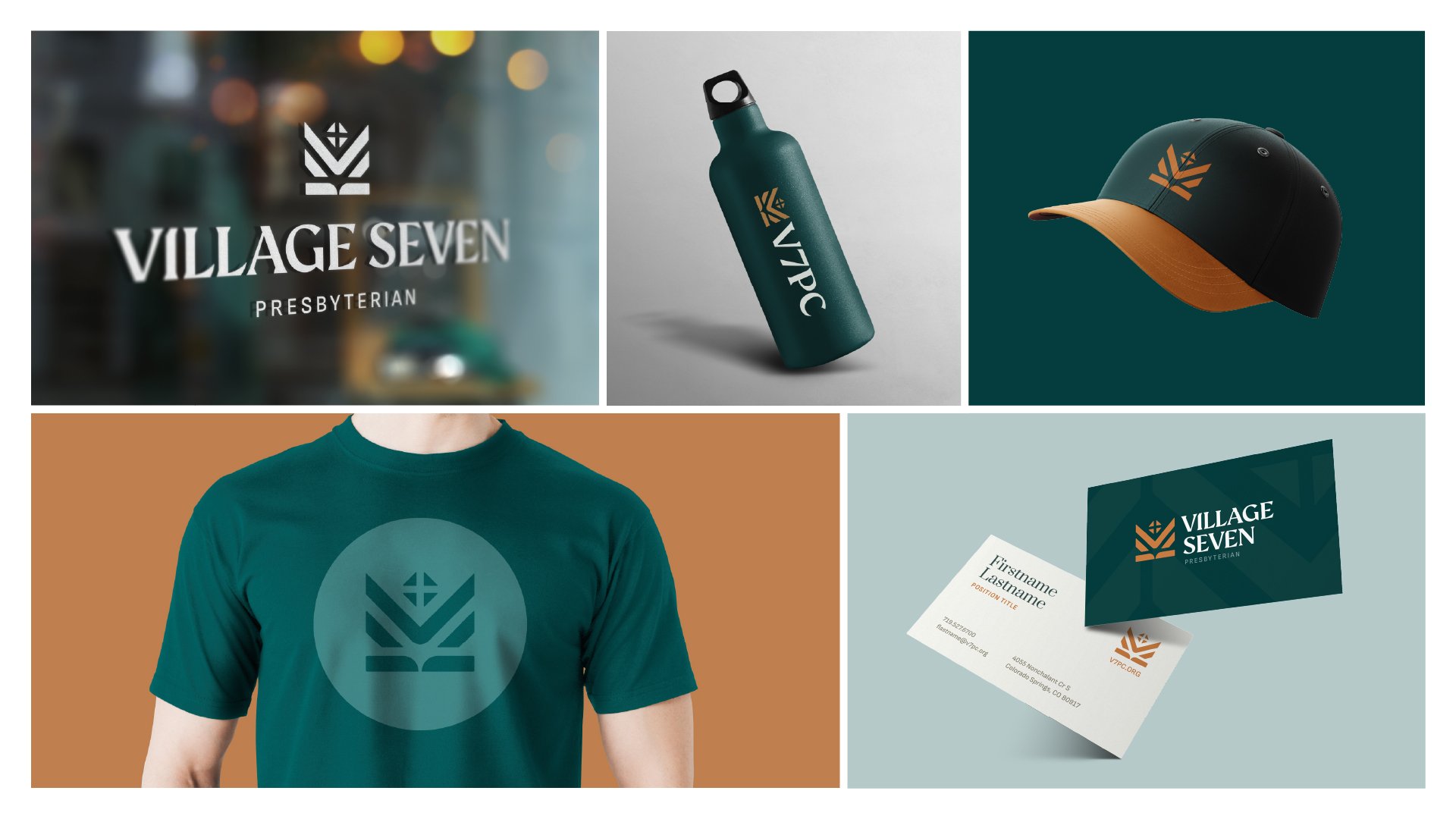
Why were these colors selected?
These colors were chosen after an extensive study of different color options. As a Colorado church, we looked to the Colorado environment as a source of inspiration as well as a point of distinction in the category. When one thinks of Colorado, what often comes to mind is evergreen and aspen trees – which is why these colors were selected to reflect where we live. We were looking for vibrancy as well as a contrasting color creating a foil against which the colors could play off each other. Also, we wanted colors that would fit comfortably in our church environment. These are our primary colors and will be complemented with additional secondary colors as we develop the full-color system.
What are the goals of this project?
1. Define what we stand for so that we have a clear vision and alignment on direction.
2. Revitalize our brand identity to ensure it is seen as current, relevant, distinctive, and meaningful.
3. Energize and inspire our staff, volunteers, and ministries to commit to our goals with a common purpose.
What will this change about Village Seven? What will be different?
The most visible change that most people will initially see will be an update to our logo and its application to signage and promotional material. However, this will be underpinned by less tangible aspects of the work such as the strategic platform and guidelines that will help guide and shape the brand experience that will be unique to Village Seven.
What is the benefit to the Church?
Clarity of direction. Renewed sense of purpose. Inspired leadership and staff. Yes, the logo will change as part of this brand refresh. But the foundational tenets of our Ministry Plan remain unchanged and is what this initiative was built on.
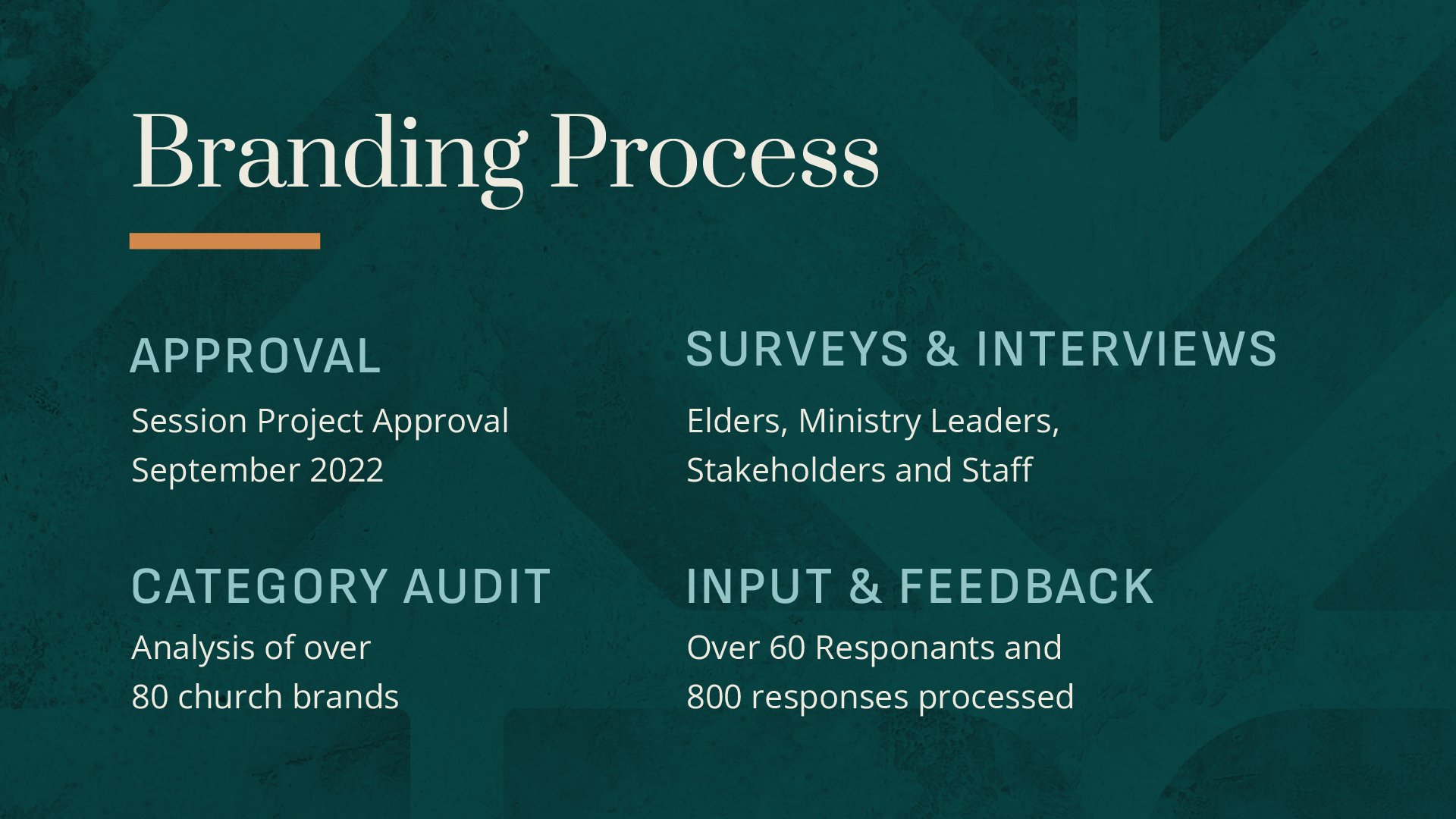
How long did this process take?
This process took 9 months to complete since the approval of the session.